

Introduction
Image optimization service was implemented through a commercial partnership with ScientiaMobile and nuu:bit. The ScientiaMobile product is ImageEngine. ImageEngine uses WURFL, which is the industry standard for device detection. The WURFL Device Description Repository provides incredible accuracy as it was developed over 15 years containing over 45,000 device profiles. The ImageEngine implementation is currently native to the nuu:bit platform. Each of the nuu:bit edge servers makes use of a custom Varnish module (written in C) and a set of VCLs rules to process the User Agent and deliver the best image for a given device/browser. Having such a low level integration with the nuu:bit edge means short Time to First Byte when making the delivery decision.

- Getting Started
- Setup
- Origin Server
- Formats and colors
- Using ImageEngine
- Auto Mode
- Directives
- Content Delivery Network
- Best Practices
- ImageEngine and native apps
- ImageEngine and Responsive Images
- Working with Client Hints
- Plugins
- Examples
Getting Started with ImageEngine
ImageEngine is an intelligent Content Delivery Network for images. Mobile now account for the majority of web traffic in many countries. ImageEngine emphasizes image optimization for mobile use cases, and also demonstrates significant value for traditional desktop-based browsing.
Using ImageEngine will reduce the image payload significantly and increase the website's performance.
The easiest way to understand ImageEngine is to see it as an intelligent Content Delivery Network (CDN). The built-in intelligence automatically (or explicitly) optimizes images for the requesting device or browser. In most cases the data traffic generated by images will be reduced by 60-70 percent compared to the original images.
Setting up
The first step is to sign up for an ImageEngine account. We offer free trials at our Pro tier. Our team will then reach out to you and provide you with an account and a unique hostname for the service. Your hostname will follow this template:
{token}.imgeng.in
For example: abcd.imgeng.in
Our team will also provide you with access to a dashboard with statistics and configuration options to suit your needs.
Your account is now ready for use. Note that there are two ways the account can be set up:
- Use the
abcd.imgeng.inhostname directly
For example:http://abcd.imgeng.in/http://example.com/image.jpeg. Easy way to get started. - Point your own custom domain to the unique ImageEngine hostname (Create a CNAME record in your DNS).
You can point your own domain, for exampleimages.example.com, toabcd.imgeng.in(or any other hostname provided by ScientiaMobile). This will enable you to refer to images like this:http://images.example.com/images/image.jpeg
Our team will assist with setting up your account to your needs.
Origin server
The original image must be available on a publicly available URL. As ImageEngine is a "pull-based" CDN, there is no need to upload or publish images in any specific way. The only requirement is that each image is reachable through its own URL.
Your origin image can be in any of the following formats:
- PNG
- GIF
- JPG
- BMP
- WEBP
- JPEG2000
- SVG *
- TIF
*) SVG files are not resized or converted, just optimized and compressed.
Do note that the maximum file size of origin images is 5 MB. It is also good practice to publish images in high resolution to account for high DPI devices.
ImageEngine will pull images on demand from the origin server and cache them according to the caching directives in the HTTP header. You may configure many aspects of ImageEngine by tweaking the HTTP headers on your origin servers. Also, do note that ImageEngine will pass on most of the HTTP headers from the origin server to the client (cookies are not passed on).
Because ImageEngine is pull-based, the first time an image is requested the response may be slower than usual. This is because ImageEngine will first have to download the image from the origin, transform it, and then cache it on the edge servers. This will of course normalize as the cache gets populated. Given this behavior, it should be noted that your origin may be bombarded with requests when ImageEngine is launched on the site for the first time because the cache needs to populate. Please discuss this with our support team before launch. Once fully operational, the ImageEngine CDN cache typically handles 98% of the traffic, while the origin servers see only 2% of the actual traffic.
Input ColorSpaces Supported
| Image Format | Greyscale | Indexed Color | RGB | sRGB | CMYK |
|---|---|---|---|---|---|
| JPG | Y | N/A | Y | Y | Y |
| JPG2000 | Y | N/A | Y | Y | Y |
| WEBP | Y | N/A | Y | Y | Y |
| GIF | Y | Y | N/A | N/A | N/A |
| 8-Bit PNG | Y | Y | N/A | N/A | N/A |
| 24-Bit PNG | Y | N/A | Y | Y | N/A |
| BMP | Y | N/A | Y | Y | N/A |
| TIFF | Y | N/A | Y | Y | N/A |
Output ColorSpaces Supported
| Image Format | Greyscale | Indexed Color | RGB | sRGB | CMYK |
|---|---|---|---|---|---|
| JPG | Y | N/A | Y | Y | Y |
| JPG2000 | Y | N/A | Y | Y | N/A |
| JPGXR | Y | N/A | Y | Y | N/A |
| WEBP | Y | N/A | Y | Y | N/A |
| GIF | Y | Y | N/A | N/A | N/A |
| 8-Bit PNG | Y | Y | N/A | N/A | N/A |
| 24-Bit PNG | Y | N/A | Y | Y | N/A |
| BMP | Y | N/A | Y | Y | N/A |
Embedded meta data, such as EXIF, is removed as a part of the optimization process. If you want to keep the meta data in the optimized image, use the meta_true directive or the pass_true directive. For jpeg images the ICC profile is maintained in the optimized image. Colors may change slightly if the image is converted between formats. If it is important for the optimized image to exactly match the colors of the origin image (rare cases), the origin image should be a jpeg and you should specify the format with the f_jpeg directive. That said, in most cases color shifting is not an issue.
Using ImageEngine
Once the account is created, origin server is online, and integration method is chosen, ImageEngine is ready to be implemented on your site(s) or app(s). ImageEngine offers a fully automated mode and a customizable mode where you can specify how an image is treated.
Auto mode
Depending on your configuration, you may need to make changes to the HTML on your web site and/or the way images are displayed in native apps.
If you have an img tag like this:
<img src="//example.com/img/car.jpeg">
You will need to prepend the URL with your unique ImageEngine hostname:
<img src="//try.imgeng.in/http://example.com/img/car.jpeg">
If your account is set up with CNAME, the image tags may look like this:
<img src="//images.example.com/img/car.jpeg">
In the case of CNAME, the origin - location of your original images - is registered in the account settings.
The examples above demonstrate the full automated optimization. In most cases, these are the recommended way to use the ImageEngine CDN.
The automatic optimization process is quite complex and and uses WURFL, Client Hints, and other available information to determine the optimal size, resolution, compression, and format. Auto-mode works well for desktop devices, and even better for mobile devices, due to the diversity of sizes, resolutions, and capabilities.
Device intelligence in action
In auto-mode, the most notable optimizations done to an image are format conversion, change in pixel size, and compression rate. ImageEngine in auto-mode will make sure that your customers get the highest quality image with the lowest possible byte-size.
Format conversion
Thanks to ImageEngine's built in device detection (WURFL), it will choose the most efficient format for a given image. The input needed to make this decision comes from WURFL device detection, manual verification, and an advanced rule set. For example, ImageEngine can accurately identify devices and browsers that support the WEBP format. This means ImageEngine can confidently convert from JPEG to WEBP, deliver huge savings in terms of byte size, and dramatically improve the web browsing experience.
Resizing
On the web today, where the majority of traffic comes from mobile devices, one size is not enough to offer a great user experience. Again, the built-in device detection knows the size of the screen - both in pixels and millimeters - and is able to resize the image to perfectly fit the viewport. This is further enhanced by ImageEngine's support for Client Hints. It can also handle high resolution displays, like Retina, out of the box and will scale the image at the actual pixel size needed to produce high quality images.
Compression
Depending on the screen size (in inches or millimeters) and the resolution of the screen, different amounts and types of compression can be applied without compromising the visual quality of the image. Furthermore, if Client Hints give indications that additional data should be saved, ImageEngine automatically applies more compression.
Directives
Directives are commands you can pass to ImageEngine in the URL which explicitly instructs ImageEngine on what to do with the image. In other words, directives override the automated decisions made by ImageEngine. In most cases, it's best to leave the discussions to ImageEngine. For example, if you explicitly ask for an image to be served as webp, all devices will get webp, even those not supporting it. However, if there are cases where you need explicit control, directives will save you.
Directives can be "mixed and matched" and some work only when others are present too. For example, fit methods are dependent on height and/or width directives.
Furthermore, some directives are not compatible with each others. For example /w_100/pc_100/ instructs ImageEngine to serve the images as 100px wide and 100% of screen size. In this case w_100 will have precedence because it is more specific.
There are two ways to make use of directives. You can append directives in the query string using the imgeng parameter (if you have a CNAME record pointing to your ImageEngine hostname, this is the only option):
<img src="//images.example.com/images/image.jpeg?imgeng=/f_webp/w_300/">The above example will produce a webp image 300px wide.
| Section | Values | Function |
|---|---|---|
| Your hostname | URL | Your hostname with a CNAME record pointing to the ImageEngine hostname. |
| Image path | Path | Path to image relative from your origin host. |
| ImageEngine directives | key_value pairs |
These settings instruct ImageEngine what transformations are expected. Optional. |
If your using the ImageEngine hostname directly, directives can also be in the path:
<img src="//try.imgeng.in/w_300/f_webp/http://jelly.com/bread.png">The above example will produce a webp image 300px wide.
| Section | Values | Function |
|---|---|---|
| ImageEngine URL | URL | This is the URL of the ImageEngine service. |
| ImageEngine directives | key_value pairs |
These settings instruct ImageEngine what transformations are expected. Optional. |
| Image URL | URL | This is the image that is to be displayed. The image itself does not need to be on the client site. |
List of supported directives
Supported directives are listed and explained below.
| Directive | Name | Value | Description | Example |
|---|---|---|---|---|
w |
Width | Integer | Desired width in pixels of resized picture. 1 2 | /w_200/ |
w_auto |
Auto width with fallback | Integer | ImageEngine will try to automatically detect the best size based on Client Hints. If no reliable size is found, it will fall back to the pixel size specified. 2 | /w_auto,200/ |
h |
Height | Integer | Desired height in pixels of resized picture. 1 2 | /h_200/ |
cmpr |
Compression | Integer (0-100) | Amount of compression to apply. Values 0 (less compression) to 100 (maximum compression). Note that the value will have different impact on different file formats and that too much compression will have impact on visual quality. | /cmpr_50/ |
f |
Format | jpg, gif, png, bmp, webp, jpegxr,jp2 |
Desired format of image. Note that even if the file extension say for example jpeg, the HTTP header content-type will have the correct mime type of the requested format. |
/f_webp/ |
m |
Fit method | stretch, box, letterbox, cropbox |
Used together with w_* and/or h_* to decide how to fit the image. |
/m_box/ /m_letterbox_ff0000_50/ |
pass |
Pass through | true |
When set, ImageEngine will pass through the origin image unmodified. | /pass_true |
s |
Sharpness | Integer (0-100) | Adjust the sharpness of the image. Values from 0 (no sharpening) to 100 (maximum sharpening). |
/s_20/ |
r |
Rotate | Integer | Will rotate the image by provided degrees. Values from -360 to 360. | /r_20/ |
pc |
Percentage of screen | 1-100 (float) | This field will use WURFL to calculate the screen width and then scale the image accordingly. 2 | /pc_50/ |
cr |
Crop | Integers | The four crop arguments are: width, height of final image, left and top (pixels from the left and top edges of the image). Note that this function does not scale the image to fit inside width and height. | /cr_10,10,100,100/ |
in |
Inline | true |
Return the image as a base64 encoded string for use in data urls | /in_true/ |
meta |
Strip EXIF data | true |
Set to true to maintain EXIF data. ICC profile will always be kept. |
/meta_true/ |
1) If a fit method is not specified, and only width or height is specified, it will select "box". If both width and height are specified, but fit is not explicitly specified, then it will assume the fit method is "stretch".
2) The target pixel size is actual intrinsic pixels ("CSS pixels") and does not account for high DPI screens. For example, if you request a 200 px wide image for a screen with DPR: 2, the image will still be 200 px wide, not 400 px.
Fit methods
box scales the image to fit within the specified dimensions. Note that the image that is returned will not necessarily be the same size as the requested dimensions, but it will fit inside a box of those dimensions method
cropbox will resample the image as small as possible while showing no canvas. This will result in some cropping if the source and output aspect ratios differ.
letterbox is the same as box, except the returned image is the exact specified size. Bars of white are placed around the image if necessary, but the image will not be scaled up. To use a color other than white, you can specify the HEX color code after the letterbox directive, like this for red: /m_letterbox_ff0000/. The canvas opacity can also be specified for images that support transparency. This is would be specified as a third parameter of m: /m_letterbox_ff0000_65/
stretch will change aspect ratio of the image to fill the new canvas defined by w_* and h_*.
Examples:
m_box
m_cropbox
m_letterbox
m_stretch
Testing and Monitoring
A general recommendation on how to test and monitor the effect and performance of ImageEngine is to continue to use the same tools you're currently using. This will give the best before-and-after comparison. It is recommended to use both real user metrics (RUM) and syntetic testing. Ultimately, according to the majority of studies done on the topic, a faster loading site will also be visible in business metrics like increased conversion rates, lower bounce rate, cart size, page views per session etc. However, there are a few things to keep in mind when setting up monitoring.
Size, format and compression are dynamic
The size, format and compression (and then also the byte size) of a specific image will vary based on quite a few variables. At the very least make sure to test
User-Agentson different devices with different screen sizes and resolutionsUser-Agentson different operating systems and versionsUser-Agentswith- and without support for Client Hints
For development and simple testing curl is a useful tool. Here is a sample command:
curl  \
    -H "Accept: text/html,application/xhtml+xml,application/xml;q=0.9,image/webp,image/apng,*/*;q=0.8" \
    -H "DPR: 2" \
    -H "Width: 200" \
    -H "Viewport-Width: 400" \
    -A "Mozilla/5.0 (Linux; Android 5.1.1; Nexus 6 Build/LYZ28E) AppleWebKit/537.36 (KHTML, like Gecko) Chrome/60.0.3112.113 Mobile Safari/537.36"  \
    -I http://try.imgeng.in/http://wurfl.github.io/i/pencils.jpg
This example include Client Hints in the request. Change the User-Agent and the additional HTTP header fields and note the difference in the response. Pay special attention to the response headers Content-Type, Content-Length and Content-DPR and see how it changes for different requests for the same image.
Tools
Even if the management console will keep track of bytes saved, it might be useful to see the numbers from different perspectives. Here is a list of tools which are useful when monitoring page speed:
Content Delivery Network
The ImageEngine CDN spans over 40 Points of Presence (POPs), located around the globe, to deliver your digital content fast. Coupled with the added benefits of our API structure, you are in control of every aspect of delivery.
Functionality
In addition to image delivery, the CDN can also cache and serve other kinds of content, including HTML, CSS, and JavaScript. It is a fully fledged CDN with all the necessary features to keep your site safe, fast, and available. Additional highlights include:
- TCP Acceleration
- Intelligent analytics that provides visibility to network performance and traffic diagnostics
- Web Application Firewall security services
- Mobile SDK, acceleration to the true edge, the device, using our Xamarin, iOS, and Android SDKs
Management console
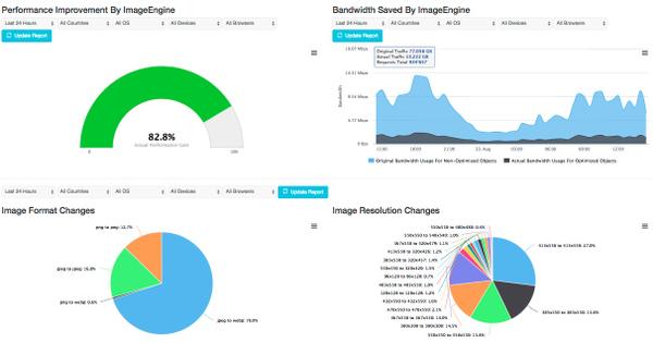
You will have access to a web interface where you can manage your account, tune the settings, see real time statistics, and more. For example, you can see how much data ImageEngine has saved you:
API
In addition to the management console, all important aspects of the CDN can be managed through our APIs. Examples of operation are:
- Account management
- DNS management
- Domain configuration
- Location management
- Log shipping
- SSL management
- Staging environment management
- Statistics
- Security operations
Best Practices
While there are no strict requirements on how to use ImageEngine, below is a list of best practices to get the most out of ImageEngine.
Always define display size of images
In your markup, you should always specify a display pixel size (width and height) in the image tags. Either by the width attribute or CSS styles. Additionally, if you've implemented Responsive Images on your site, include the sizes attribute.
In some cases, ImageEngine may return a bigger image than expected to cater to high DPI screens. If the design of the page expects a 400 pixel wide image and ImageEngine returns a 800 pixel wide image for devices with a pixel ratio of 2, the design may be broken if the markup does not define a display size of the image. Similar situations may occur when using Client Hints.
Origin image in high resolution
If your publishing -system or -workflow supports it, and based on the design of you page, origin images should be of higher resolution than you strictly need. For example, if your design has a hero image with a display width of 1000 pixels (CSS pixels), ImageEngine will try to serve this image at 2000 pixels width for screens with a pixel ratio of 2. Because ImageEngine does not scale images up, the origin image need to be at least 2000 physical pixels wide in order to get the best possible quality. See also Client Hints.
Use Auto mode
In most cases using ImageEngine without directives is the best option. Only use directives for specific cases. When you use directives, some, or all, of the built in optimization logic may not be applied. For example, if you specify /f_webp/ all devices/browsers, even those not supporting webp, will be served a webp image.
Use Resource Hints
Resource Hints will speed up the connection to ImageEngine by telling the browser as early as possible to connect to the ImageEngine server. This way, the browser will have the connection open when it is needed later. Resource hints are enabled in the <head> section of your markup this:
<link rel="preconnect" href="//images.example.com" crossorigin>
Or alternatively in the HTTP response headers of your web server like this:
Link: <//images.example.com>; rel=preconnect
Use a CNAME DNS record
Why use a CNAME DNS record? A CNAME DNS record does not expose the originImageEngine hostname directly, so it appears more secure. In terms of functionality, there is no difference between using a CNAME'd hostname versus the ImageEngine hostname directly. However, some of our plugins only work with the ImageEngine hostname.
Use Responsive Images
The main reason why ImageEngine benefits from Responsive Images syntax is Client Hints. You can read more about Responsive Images and ImageEngine below.
Summarized, the w_auto directive, and the sizes attribute is key. Here is an example:
<img src="//try.imgeng.in/w_auto,800/http://wurfl.github.io/i/pencilsx.jpg" sizes="90vw">
If you need different sized images to be served, depending on viewport size, you can use media queries in the sizes attribute.
Use Client Hints
Client Hints enable the browser to send more detailed information about what size the image should be, relative to the viewport size.
To enable Client Hints you'll have to explicitly enable it by adding the below <meta> tag to your <head> element:
<meta http-equiv="Accept-CH" content="DPR, Viewport-Width, Width, Save-Data">
or adding a Link HTTP header in the response of the html:
Accept-CH: DPR, Width, Viewport-Width, Save-Data
Using client hints and ImageEngine with responsive images will generate a perfectly sized and optimized image. However, note that the Width header is only sent if the browser is able to determine the intended display size of the image. Hence, you must provide a sizes attribute to the image tags. ImageEngine will only return Content-DPR when Width header is present in the request. If the origin image is smaller than the intended display size, Content-DPR will be < 0 because ImageEngine does not scale images to larger sizes than the original.
The Client Hints specification can be found here. For more details, please read this article on Client Hints, Responsive Images and ImageEngine.
Native Apps: Use meaningful User Agents
Optimizing images is equally important for apps. ImageEngine relies heavily on device detection. For this reason, it is important that applications (fully native or hybrids) provide meaningful User-Agent-strings in the request. For hybrid apps this is less of a challenge, but for fully native apps this issue must be addressed in order to avoid the default values.
The User-Agent for Andorid apps must follow this syntax:
<AppName>/<version> Dalvik/<version> (Linux; U; Android <android version>; <device ID> Build/<buildtag>)
For example:
Myapp/1 Dalvik/2.1.0 (Linux; U; Android 6.0.1; vivo 1610 Build/MMB29M)
The User-Agent for iOS apps must follow this syntax:
<AppName>/<version> <iDevice platform><model identifier> iOS/<OS version> CFNetwork/<version> Darwin/<version>
For example:
MyApp/1 iPhone5,2 iOS/10_1 CFNetwork/808.3 Darwin/16.3.0
See the blog post How to Correctly Form User-Agents for Mobile Apps for more information.
ImageEngine and Responsive Images
ImageEngine is designed to make the work with responsive images easier and more efficient. If you implement Responsive images "by the book", the markup and image logistics quickly become unmanageable long term. Still, responsive images solves critical issues regarding performance and art direction among other things. Thanks to Client Hints backed by device detection ImageEngine will reduce complexity, make image logistics easier and, of course, speed up your site due to lower byte size of the images. Below are a few examples.
Implementing responsive images on your site can quickly become a difficult to maintain.
TL;DR: With ImageEngine you can replace the image tag below...
<picture>
  <!-- serve WebP to Chrome and Opera -->
  <source
    media="(min-width: 50em)"
    sizes="50vw"
    srcset="/image/thing-200.webp 200w, /image/thing-400.webp 400w,
        /image/thing-800.webp 800w, /image/thing-1200.webp 1200w,
        /image/thing-1600.webp 1600w, /image/thing-2000.webp 2000w"
    type="image/webp">
  <source
    sizes="(min-width: 30em) 100vw"
    srcset="/image/thing-crop-200.webp 200w, /image/thing-crop-400.webp 400w,
        /image/thing-crop-800.webp 800w, /image/thing-crop-1200.webp 1200w,
        /image/thing-crop-1600.webp 1600w, /image/thing-crop-2000.webp 2000w"
    type="image/webp">
  <!-- serve JPEGXR to Edge -->
  <source
    media="(min-width: 50em)"
    sizes="50vw"
    srcset="/image/thing-200.jpgxr 200w, /image/thing-400.jpgxr 400w,
        /image/thing-800.jpgxr 800w, /image/thing-1200.jpgxr 1200w,
        /image/thing-1600.jpgxr 1600w, /image/thing-2000.jpgxr 2000w"
    type="image/vnd.ms-photo">
  <source
    sizes="(min-width: 30em) 100vw"
    srcset="/image/thing-crop-200.jpgxr 200w, /image/thing-crop-400.jpgxr 400w,
        /image/thing-crop-800.jpgxr 800w, /image/thing-crop-1200.jpgxr 1200w,
        /image/thing-crop-1600.jpgxr 1600w, /image/thing-crop-2000.jpgxr 2000w"
    type="image/vnd.ms-photo">
  <!-- serve JPEG to others -->
  <source
    media="(min-width: 50em)"
    sizes="50vw"
    srcset="/image/thing-200.jpg 200w, /image/thing-400.jpg 400w,
        /image/thing-800.jpg 800w, /image/thing-1200.jpg 1200w,
        /image/thing-1600.jpg 1600w, /image/thing-2000.jpg 2000w">
  <source
    sizes="(min-width: 30em) 100vw"
    srcset="/image/thing-crop-200.jpg 200w, /image/thing-crop-400.jpg 400w,
        /image/thing-crop-800.jpg 800w, /image/thing-crop-1200.jpg 1200w,
        /image/thing-crop-1600.jpg 1600w, /image/thing-crop-2000.jpg 2000w">
  <!-- fallback for browsers that don't support picture -->
  <img src="/image/thing.jpg" width="50%">
</picture>
...with this...
<img src="//images.example.com/images/thing.jpg" sizes="50vw">
Retrofit your existing img tags
The key to optimizing ImageEngine and responsive images is to enable Client Hints. This will make supporting browsers send extra HTTP headers that ImageEngine can use with surgical precision to optimize the image. In addition to opting-in to Client Hints, you'll need to change your <img> tags slightly. If your current image tags look like this:
<img src="//images.example.com/images/thing.jpg" width="200px">
You'll need to add the sizes attribute:
<img src="//images.example.com/images/thing.jpg" width="200px" sizes="200px">
By adding the sizes attribute, the browser will be able to figure out the value of the width Client Hint header, which will be added to the image request. For browsers that don't support Client Hints, you can use the w_auto directive:
<img src="//images.example.com/images/thing.jpg?imgeng?/w_auto,200/" width="200px" sizes="200px">
If ImageEngine is unable to determine an accurate size for the image, the fallback will be 200 pixels. Of course, you can add media queries in the sizes attribute too:
<img src="//images.example.com/images/thing.jpg?imgeng?/w_auto,200/" syle="@media {(min-width: 30em) 200px, 500px;}" sizes="(min-width: 30em) 200px, 500px">
Regarding the above example, don't worry about the "format switching", <source type="image/webp" srcset="...">. ImageEngine will automatically handle this based on the browser's capabilities.
Working with Client Hints
ImageEngine supports the following Client Hints:
| Client Hint | Description |
|---|---|
DPR |
Device Pixel Ratio of the device. If the DPR is 2, one CSS pixel is 4 physical pixels on the screen. |
Width |
Intrinsic size of the image in pixels. Physical pixels. |
Viewport-Width |
Size of Viewport in CSS pixels |
Save-Data |
Indicate client's preference for reduced data usage. More compression will be applied. |
To make use of Client Hints, you'll need to activate it on your web server.
In order to fully utilize ImageEngine and Client Hints, it is important to understand the basics. Before the arrival of high density displays (such as the Retina display), designers only needed to worry about one type of pixels. 200px is 200px regardless. However, with high DPI displays, there are now two types of pixels to keep in mind. The pixel size we already know is dubbed as "CSS pixels" or "display pixels". For example, when you define a <div> to be 200px wide in CSS, the div will actually be displayed at 200px, regardless of how many physical pixels the screen uses to display the div.
With the arrival of high dpi displays, one quickly needed a way to show crisp "retina images" even on webpages. This means that, for a device like the iPhone with a DPR of 2, an image on your webpage with a width of 200 pixels defined in your CSS file actually needs to be 400 pixels wide - simply double the size. The formula is CSS pixels x DPR = physical image size. So now, a designer or developer has to make two sizes of the image. If only it was that easy... Today DPR range from 1 to 4. With decimals. Which make the task unscalable.
ImageEngine will automatically resolve this provided that the origin image is high resolution. If an origin image is 200 pixels wide and the display size is 200 pixels, ImageEngine will not scale the image up to support high DPI screens and you'll lose the high DPI support. A good rule of thumb is to have the origin image be at least twice the size of its intended display size.
The response from ImageEngine will confirm the actual DPR of the image in a response HTTP header:
Content-DPR: <long>
The value of the header depends on the DPR and Width headers of the requesting device and the size of the origin image.
If DPR is 1, Width is 100 and the origin image is 100 pixels, Content-DPR will be 1.
If DPR is 2, Width is 200 and the origin image is 100 pixels, Content-DPR will be 0.5. (poor quality)
If DPR is 2, Width is 200 and the origin image is 200 pixels, Content-DPR will be 2. (best quality)
Content-DPR response header will only be sent if the request has a Width header.
More information:
- Automating resource selection with client hints
- Leaner responsive images with client hints
- Client hints specification
Plugins
To ease the use and integration of ImageEngine, we've made a few plugins (free and open source) for popular frameworks and platforms. More information and documentation are available in the links below:
Examples
Auto mode. Size, format and compression decided based on browser- and device capabilities.

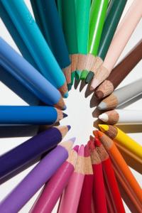
<img src="https://try.imgeng.in/http://wurfl.github.io/i/pencils.jpg">
Explicitly requesting an image 300 pixels wide

<img src="https://try.imgeng.in/w_300/http://wurfl.github.io/i/pencils.jpg">
Letter-boxing the image inside a 500x500 box with red padding and opacity.
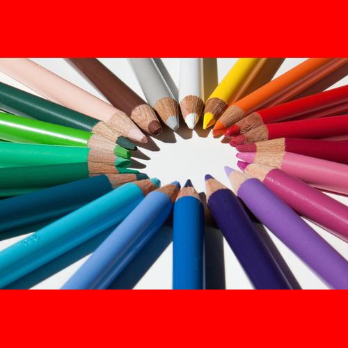
<img src="https://try.imgeng.in/w_500/h_500/m_letterbox_ff0000_65/http://wurfl.github.io/i/pencils.jpg">
Setting compression to 80.

<img src="https://try.imgeng.in/w_500/cmpr_80/http://wurfl.github.io/i/pencils.jpg">
Fallback size when no specific size can be determined automatically.

<img src="https://try.imgeng.in/w_auto,300/http://wurfl.github.io/i/pencils.jpg">
Rotate the image 90 degrees.
<img src="https://try.imgeng.in/w_auto,200/r_90/http://wurfl.github.io/i/pencils.jpg">
Cropping the image.
<img src="https://try.imgeng.in/cr_500,500,100,100/http://wurfl.github.io/i/pencils.jpg">
Manually sharpening the image. Good for thumbnails.

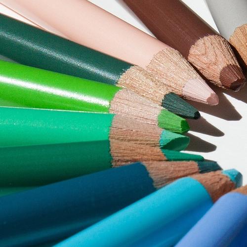
<img src="https://try.imgeng.in/h_200/s_50/http://wurfl.github.io/i/pencils.jpg">
Responsive images enhanced with client hints and fallback size.
<img src="https://try.imgeng.in/w_auto,300/http://wurfl.github.io/i/pencils.jpg" sizes="30vw">
0 Comments